AlertDialog
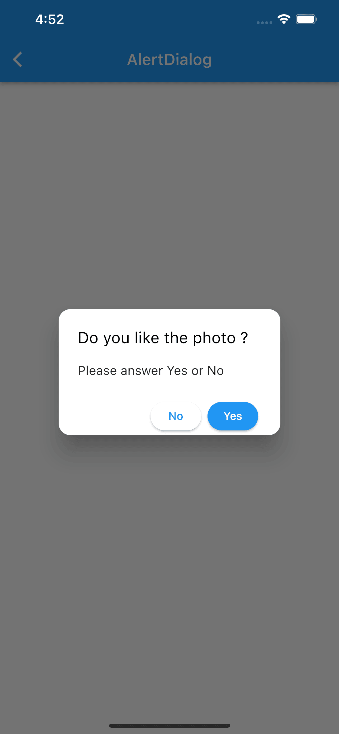
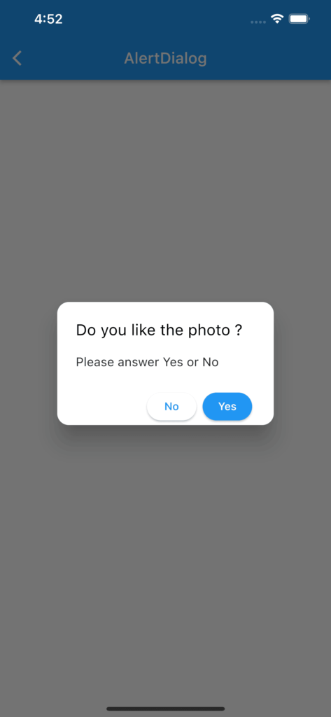
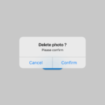
Shows a simple pop-up dialog fully customizable with 2 buttons
import 'package:flutter/material.dart';
class DialogAlert extends StatefulWidget {
const DialogAlert({Key? key}) : super(key: key);
@override
_DialogAlertState createState() => _DialogAlertState();
}
class _DialogAlertState extends State<DialogAlert> {
@override
Widget build(BuildContext context) {
return Scaffold(
appBar: AppBar(title: const Text("AlertDialog")),
body: Container(
padding: const EdgeInsets.all(20),
alignment: Alignment.center,
child: Column(
mainAxisAlignment: MainAxisAlignment.spaceAround,
children: [
oneSingleButton(context),
],
)
)
);
}
/// **********************************************************************
/// This button just for calling the AlertDialog
/// **********************************************************************
Widget oneSingleButton(BuildContext context) {
return ElevatedButton(
onPressed: () {
confirmPhoto(context);
},
style: ElevatedButton.styleFrom(
backgroundColor: Colors.blue,
shape: RoundedRectangleBorder(borderRadius: BorderRadius.circular(20.0))
),
child: const Text("Tap here")
);
}
/// **********************************************************************
/// Pops up the AlertDialog
/// **********************************************************************
void confirmPhoto(context) {
showDialog(
context: context,
builder: (context) {
return AlertDialog(
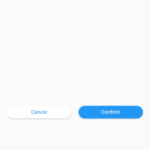
title: const Text("Do you like the photo ?"),
titleTextStyle: const TextStyle(
fontSize: 20,
color: Colors.black),
shape: const RoundedRectangleBorder(
borderRadius: BorderRadius.all(Radius.circular(15))
),
content: const Text("Please answer Yes or No"),
actionsPadding: const EdgeInsets.symmetric(horizontal: 28),
actions: [
// Button No
ElevatedButton(
style: ElevatedButton.styleFrom(
foregroundColor: Colors.blue,
backgroundColor: Colors.white,
shape: RoundedRectangleBorder(borderRadius: BorderRadius.circular(20.0))
),
child: Text("No",
style: TextStyle(color: Theme.of(context).colorScheme.secondary)),
onPressed: () {
print("Answer is No");
Navigator.pop(context);
},
),
// Button Yes
ElevatedButton(
style: ElevatedButton.styleFrom(
foregroundColor: Colors.white,
backgroundColor: Colors.blue,
shape: RoundedRectangleBorder(borderRadius: BorderRadius.circular(20.0),
)
),
child: Text("Yes",
style: TextStyle(color: Theme.of(context).bottomAppBarColor)),
onPressed: () {
print("Answer is Yes");
Navigator.pop(context);
},
),
],
);
}
);
}
}