Buttons & Dialogs
ElevatedButton
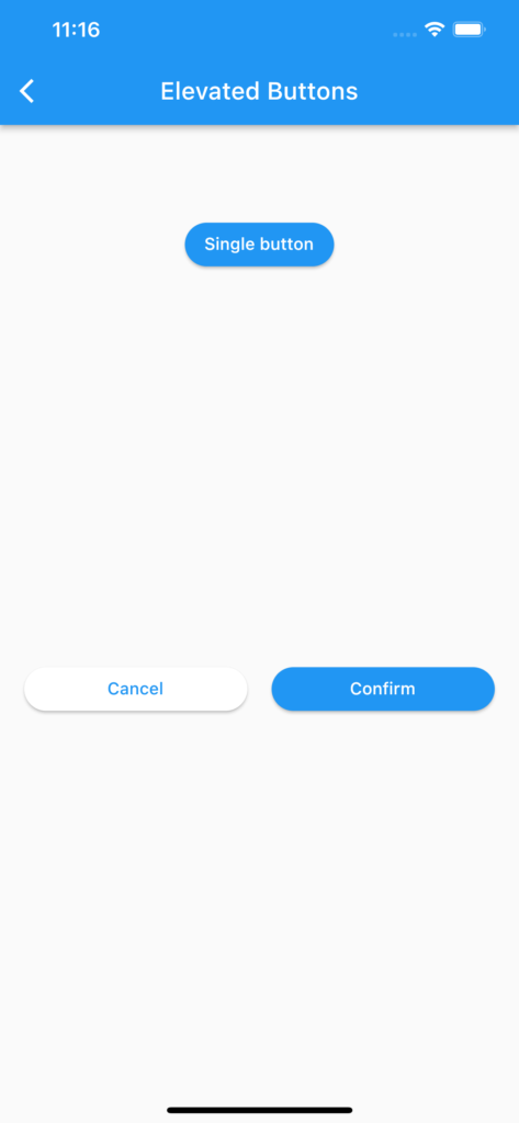
Simple dialogs using:
- 1 centered single button (width adapted to text)
- 2 aligned and expanded buttons (Cancel & Confirm).
import 'package:flutter/material.dart';

class ButtonElevated extends StatefulWidget {
  const ButtonElevated({Key? key}) : super(key: key);

  @override
  _ButtonElevatedState createState() => _ButtonElevatedState();
}

class _ButtonElevatedState extends State<ButtonElevated> {
  @override
  Widget build(BuildContext context) {
    return Scaffold(
      appBar: AppBar(title: const Text("Elevated Buttons")),
      body: Container(
        padding: const EdgeInsets.all(20),
        alignment: Alignment.center,
        child: Column(
          mainAxisAlignment: MainAxisAlignment.spaceAround,
          children: [
            oneSingleButton(context),
            const SizedBox(height: 100),
            twoAlignedButtons(context),
            const SizedBox(height: 150),
          ],
        )
      )
    );
  }

  Widget oneSingleButton(BuildContext context) {
    return ElevatedButton(
      onPressed: () {
        print("Single button pressed");
      },
      style: ElevatedButton.styleFrom(
          backgroundColor: Colors.blue,
          shape: RoundedRectangleBorder(borderRadius: BorderRadius.circular(20.0))
      ),
      child: const Text("Single button")
    );
  }


  Widget twoAlignedButtons(BuildContext context) {
    return Row(
      mainAxisAlignment: MainAxisAlignment.spaceAround,
      children: [
        Expanded(child: cancelButton(context)),
        const VerticalDivider(width: 20),
        Expanded(child: confirmButton(context)),
      ],
    );
  }

  Widget cancelButton(BuildContext context) {
    return ElevatedButton(
        onPressed: () {
          print("Cancel button pressed");
          Navigator.pop(context);
        },
        style: ElevatedButton.styleFrom(
            foregroundColor: Colors.blue,
            backgroundColor: Colors.white,
            shape: RoundedRectangleBorder(borderRadius: BorderRadius.circular(20.0))
        ),
        child: const Text("Cancel")
    );
  }

  Widget confirmButton(BuildContext context) {
    return ElevatedButton(
        onPressed: () {
          print("Confirm button pressed");
        },
        style: ElevatedButton.styleFrom(
            foregroundColor: Colors.white,
            backgroundColor: Colors.blue,
            shape: RoundedRectangleBorder(borderRadius: BorderRadius.circular(20.0))
        ),
        child: const Text("Confirm")
    );
  }

}
AlertDialog
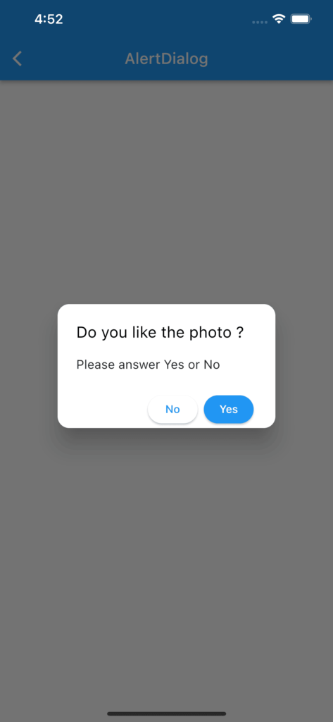
Shows a simple pop-up dialog fully customizable with 2 buttons
import 'package:flutter/material.dart';


class DialogAlert extends StatefulWidget {
  const DialogAlert({Key? key}) : super(key: key);

  @override
  _DialogAlertState createState() => _DialogAlertState();
}

class _DialogAlertState extends State<DialogAlert> {

  @override
  Widget build(BuildContext context) {
    return Scaffold(
        appBar: AppBar(title: const Text("AlertDialog")),
        body: Container(
            padding: const EdgeInsets.all(20),
            alignment: Alignment.center,
            child: Column(
              mainAxisAlignment: MainAxisAlignment.spaceAround,
              children: [
                oneSingleButton(context),
              ],
            )
        )
    );
  }

  /// **********************************************************************
  /// This button just for calling the AlertDialog
  /// **********************************************************************
  Widget oneSingleButton(BuildContext context) {
    return ElevatedButton(
        onPressed: () {
          confirmPhoto(context);
        },
        style: ElevatedButton.styleFrom(
            backgroundColor: Colors.blue,
            shape: RoundedRectangleBorder(borderRadius: BorderRadius.circular(20.0))
        ),
        child: const Text("Tap here")
    );
  }

  /// **********************************************************************
  /// Pops up the AlertDialog
  /// **********************************************************************
  void confirmPhoto(context) {
    showDialog(
        context: context,
        builder: (context) {
          return AlertDialog(
            title: const Text("Do you like the photo ?"),
            titleTextStyle: const TextStyle(
                fontSize: 20,
                color: Colors.black),
            shape: const RoundedRectangleBorder(
                borderRadius: BorderRadius.all(Radius.circular(15))
            ),
            content: const Text("Please answer Yes or No"),
            actionsPadding: const EdgeInsets.symmetric(horizontal: 28),
            actions: [

              // Button No
              ElevatedButton(
                style: ElevatedButton.styleFrom(
                    foregroundColor: Colors.blue,
                    backgroundColor: Colors.white,
                    shape: RoundedRectangleBorder(borderRadius: BorderRadius.circular(20.0))
                ),
                child: Text("No",
                    style: TextStyle(color: Theme.of(context).colorScheme.secondary)),
                onPressed: () {
                  print("Answer is No");
                  Navigator.pop(context);
                },
              ),

              // Button Yes
              ElevatedButton(
                style: ElevatedButton.styleFrom(
                    foregroundColor: Colors.white,
                    backgroundColor: Colors.blue,
                    shape: RoundedRectangleBorder(borderRadius: BorderRadius.circular(20.0),
                    )
                ),
                child: Text("Yes",
                    style: TextStyle(color: Theme.of(context).bottomAppBarColor)),
                onPressed: () {
                  print("Answer is Yes");
                  Navigator.pop(context);
                },
              ),
            ],
          );
        }
    );

  }
}
CupertinoAlertDialog
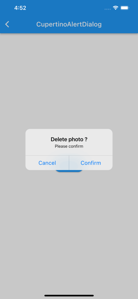
Shows a simple Cupertino style pop-up dialog fully customizable with 2 buttons
import 'package:flutter/cupertino.dart';
import 'package:flutter/material.dart';

class ShowDialogCupertino extends StatefulWidget {
  const ShowDialogCupertino({Key? key}) : super(key: key);

  @override
  _ShowDialogCupertinoState createState() => _ShowDialogCupertinoState();
}

class _ShowDialogCupertinoState extends State<ShowDialogCupertino> {

  @override
  Widget build(BuildContext context) {
    return Scaffold(
        appBar: AppBar(title: const Text("CupertinoAlertDialog")),
        body: Container(
            padding: const EdgeInsets.all(20),
            alignment: Alignment.center,
            child: Column(
              mainAxisAlignment: MainAxisAlignment.spaceAround,
              children: [
                oneSingleButton(context),
              ],
            )
        )
    );
  }

  /// **********************************************************************
  /// This button just for calling the AlertDialog
  /// **********************************************************************
  Widget oneSingleButton(BuildContext context) {
    return ElevatedButton(
        onPressed: () {
          confirmPhoto(context);
        },
        style: ElevatedButton.styleFrom(
            backgroundColor: Colors.blue,
            shape: RoundedRectangleBorder(borderRadius: BorderRadius.circular(20.0))
        ),
        child: const Text("Tap here")
    );
  }

  /// **********************************************************************
  /// Cupertino style dialog
  /// **********************************************************************
  Future<void> confirmPhoto(BuildContext context) async {

    showCupertinoDialog(
        context: context,
        builder: (builder) => CupertinoAlertDialog(
          title: const Text("Delete photo ?"),
          content: const Text("Please confirm"),
          actions: [
            CupertinoDialogAction(
                child: const Text("Cancel"),
                onPressed: () {
                  print("Canceled");
                  Navigator.of(context).pop(); }
            ),
            CupertinoDialogAction(
                child: const Text("Confirm"),
                onPressed: (){
                  print("Confirmed");
                  Navigator.of(context).pop();
                }
            )
          ],
        )
    );
  }
}
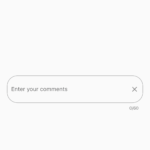
Simple TextField
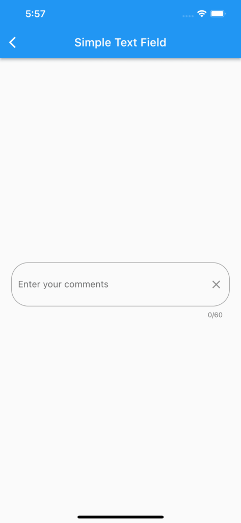
Simple TextField allowing to capture free text up to 60 characters max over 2 lines. A button (cross) is displayed as a suffix icon to clear the input data. The text capture is completed when Enter key is pressed.
import 'package:flutter/material.dart';


class ShowTextField extends StatefulWidget {
  const ShowTextField({Key? key}) : super(key: key);

  @override
  _ShowTextFieldState createState() => _ShowTextFieldState();
}

class _ShowTextFieldState extends State<ShowTextField> {

  // Controller for text editing
  final TextEditingController _controller = TextEditingController();
  final _focusComments = FocusNode();


  @override
  Widget build(BuildContext context) {
    return Scaffold(
        appBar: AppBar(title: const Text("Simple Text Field")),
        body: Container(
            padding: const EdgeInsets.all(20),
            alignment: Alignment.center,
            child: Center(
              child: DisplayTextField(context)
            )
        )
    );
  }


  Widget DisplayTextField(BuildContext context) {
    return Expanded(
      child: TextField(
        controller: _controller,
        focusNode: _focusComments,
        textCapitalization: TextCapitalization.sentences,
        maxLength: 100,
        maxLines: 2,
        keyboardType: TextInputType.text,
        textInputAction: TextInputAction.done,
        //maxLengthEnforcement: MaxLengthEnforcement.enforced,
        decoration: InputDecoration(
            border:  const OutlineInputBorder(
                borderRadius: BorderRadius.all(Radius.circular(30))
            ),
            labelText: "Enter your comments",

            suffixIcon: IconButton(
                onPressed: _controller.clear,
                icon: const Icon(Icons.clear)
            )
        ),
        onSubmitted: (value) => print("Captured text = $value"),
      ),
    );
  }
}
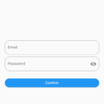
Form
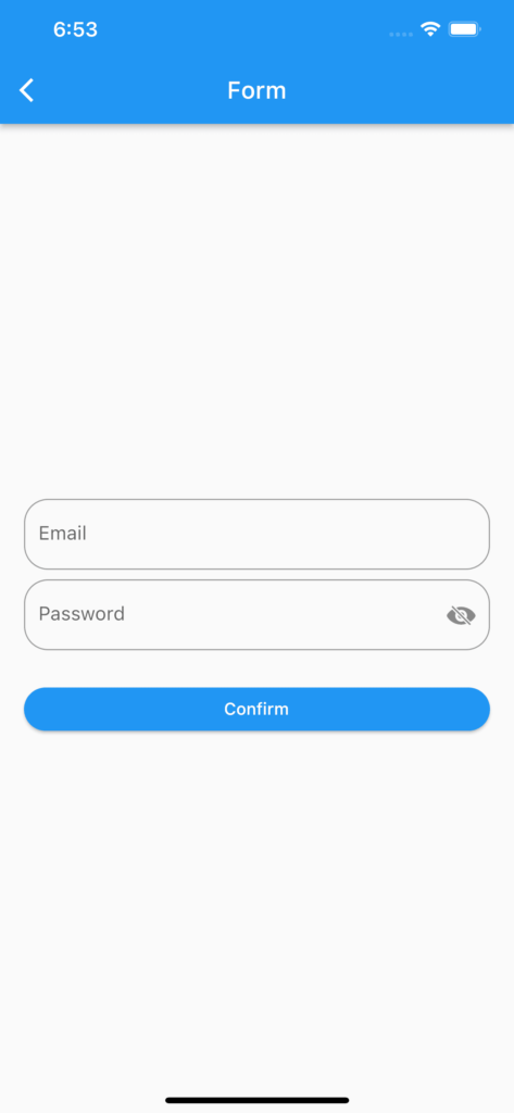
Typical login form to capture email and password with TextFormField widgets and one ElevatedButton to confirm inputs. Password field can be obscured or displayed in clear. When Confirm is hit, email and password are then validated against criteria.
import 'package:flutter/material.dart';
import 'package:flutter/cupertino.dart';

class ShowForm extends StatefulWidget {
  const ShowForm({Key? key}) : super(key: key);

  @override
  _ShowFormState createState() => _ShowFormState();
}

class _ShowFormState extends State<ShowForm> {

  // Controllers for text editing
  final TextEditingController _emailTextController = TextEditingController();
  final _focusEmail = FocusNode();
  final TextEditingController _passwordTextController = TextEditingController();
  final _focusPassword = FocusNode();

  bool _obscurePassword = true;

  // Form management key
  static final GlobalKey<FormState> _formKey = GlobalKey<FormState>();


  @override
  Widget build(BuildContext context) {
    return Scaffold(
        appBar: AppBar(title: const Text("Form")),
        body: Container(
            padding: const EdgeInsets.all(20),
            alignment: Alignment.center,
            child: Center(
                child: loginForm(context)
            )
        )
    );
  }

  /// **********************************************************************
  /// Sign in form with email/password: 2 TextFormFields and 1 ElevatedButton
  /// **********************************************************************
  Widget loginForm(BuildContext context) {
    return Form(
      key: _formKey,
      child: Column(
        mainAxisSize: MainAxisSize.min,

        children: <Widget>[

          emailInput(context),

          const SizedBox(height: 8.0),

          passwordInput(context),

          const SizedBox(height: 25.0),

          confirmButton(context)

        ],
      ),
    );
  }

  /// **********************************************************************
  /// Email input capture with TextFormField
  /// **********************************************************************
  Widget emailInput(BuildContext context) {
    return TextFormField(
      controller: _emailTextController,
      focusNode: _focusEmail,
      validator: (value) => _validateEmail(context: context, email: value!),
      decoration: InputDecoration(
        hintText: "Email",
        border: const OutlineInputBorder(
            borderRadius: BorderRadius.all(Radius.circular(20),
            )),
        errorBorder: UnderlineInputBorder(
          borderRadius: BorderRadius.circular(6.0),
          borderSide: const BorderSide(
            color: Colors.red,
          ),
        ),
      ),
    );
  }

  /// **********************************************************************
  /// Password input capture with TextFormField
  /// **********************************************************************
  Widget passwordInput(BuildContext context) {
    return TextFormField(
      controller: _passwordTextController,
      focusNode: _focusPassword,
      obscureText: _obscurePassword,
      validator: (value) => _validatePassword(context: context, password: value!),
      decoration: InputDecoration(
          hintText: "Password",
          border: const OutlineInputBorder(
              borderRadius: BorderRadius.all(Radius.circular(20),
              )
          ),
          errorBorder: UnderlineInputBorder(
            borderRadius: BorderRadius.circular(6.0),
            borderSide: const BorderSide(
              color: Colors.red,
            ),
          ),
          suffixIcon: IconButton(
            onPressed: () {
              setState(() {
                _obscurePassword = !_obscurePassword;
              });
            },
            icon: (_obscurePassword)
                ? const Icon(CupertinoIcons.eye_slash_fill)
                : const Icon(CupertinoIcons.eye_fill),
          )
      ),
    );
  }

  /// **********************************************************************
  /// Button to confirm the login details
  /// **********************************************************************
  Widget confirmButton(BuildContext context) {
    return Row(
      children: [
        Expanded(
            child: ElevatedButton(
              onPressed: () => _login(),
              style: ElevatedButton.styleFrom(
                  backgroundColor: Colors.blue,
                  shape: RoundedRectangleBorder(borderRadius: BorderRadius.circular(20.0))
              ),

              child: Text("Confirm"),
              ),
            )
        ]
    );
  }

/// **********************************************************************
/// Called when confirmButton is pressed
/// **********************************************************************
Future<void> _login() async {
  _focusEmail.unfocus();
  _focusPassword.unfocus();

  // Validation of all inputs
  if (_formKey.currentState!.validate()) {
    print("Login with email = ${_emailTextController.text} "
        "and password = ${_passwordTextController.text}");
  }
}

  /// **********************************************************************
  /// Checks whether the email address field is empty
  /// and validate format using a regular expression
  /// **********************************************************************
  static String? _validateEmail({required BuildContext context, required String email}) {
    RegExp emailRegExp = RegExp(
        r"^[a-zA-Z0-9.!#$%&'*+/=?^_`{|}~-]+@[a-zA-Z0-9](?:[a-zA-Z0-9-]{0,253}[a-zA-Z0-9])?(?:\.[a-zA-Z0-9](?:[a-zA-Z0-9-]{0,253}[a-zA-Z0-9])?)*$");

    if (email.isEmpty) {
      return "Please enter a valid email address";
    } else if (!emailRegExp.hasMatch(email)) {
      return "Please enter a valid email address";
    }

    return null;
  }

  /// **********************************************************************
  /// Checks whether the password field is empty
  /// and verify that the length is longer than six characters
  /// **********************************************************************
  static String? _validatePassword({required BuildContext context, required String password}) {

    if (password.isEmpty) {
      return "Password must contain at least 6 characters";
    } else if (password.length < 6) {
      return "Password must contain at least 6 characters";
    }

    return null;
  }
}